‘Our identity, reputation and expertise is the major driver of our business. A consultancy service that came in and sought to impose rehearsed ideas on us wouldn’t have worked. Spork worked because they were partners not pedagogues.’
Stephen Jones, Chief Product Officer


Legal 500 Design
Judging a website by its cover
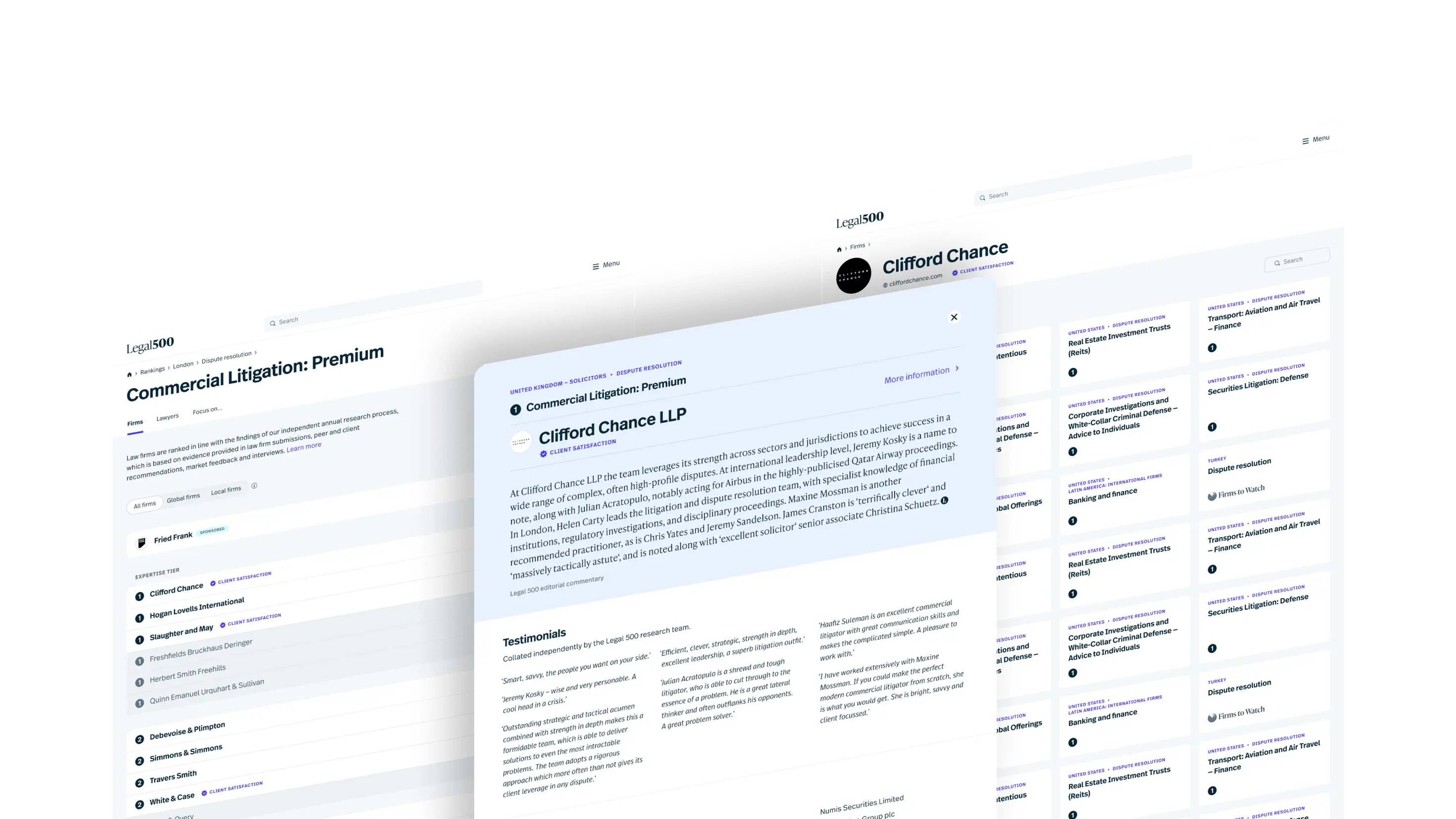
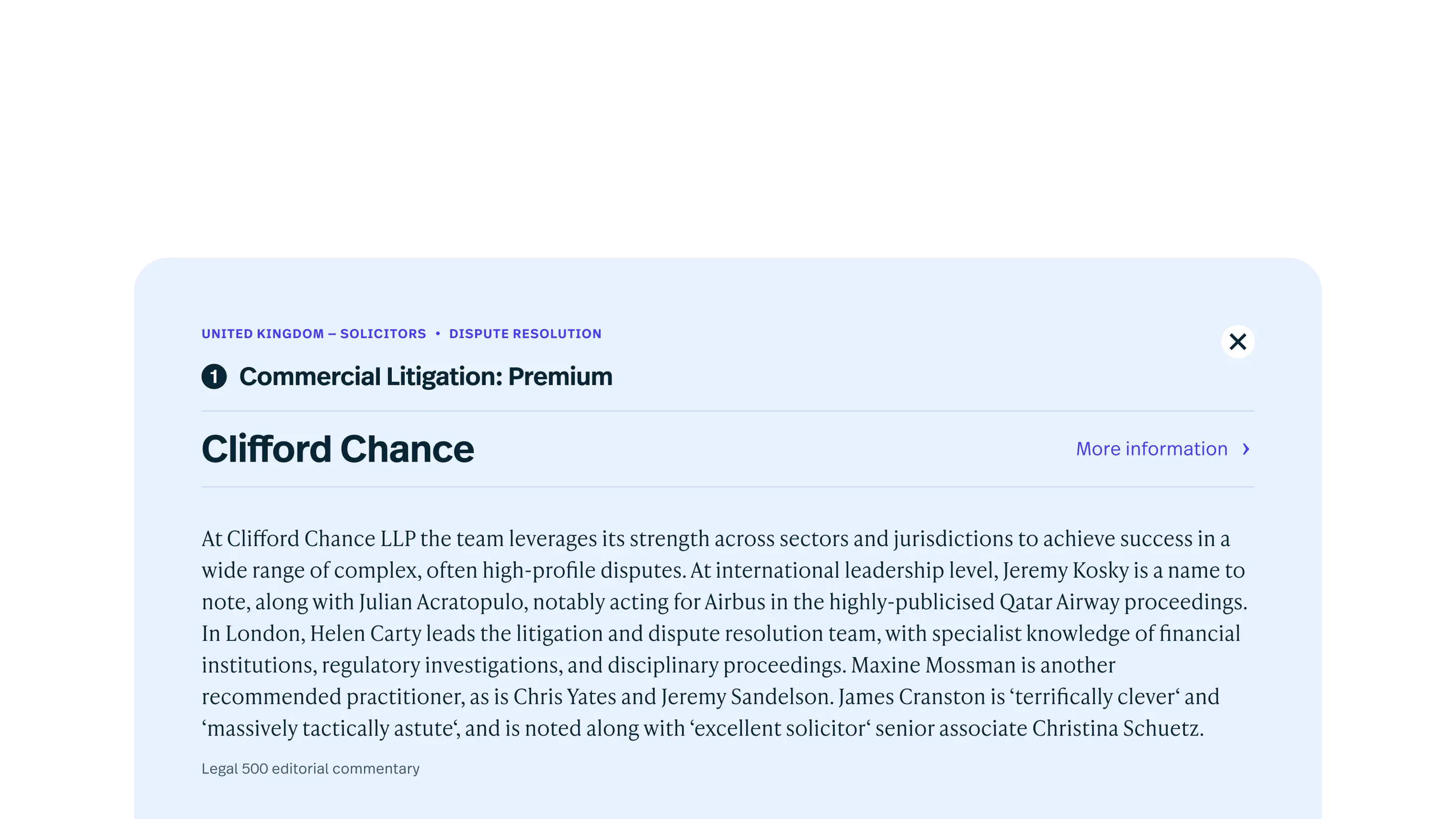
Legal 500 sought to modernise their platform to meet evolving user expectations, ensuring their trusted legal rankings and resources remained accessible and relevant in a competitive digital landscape. Spork stepped in to deliver a design transformation that put users first.
Client
Legal 500
Problem
An overwhelming amount of content made for a confusing user interface that did not match up to Legal 500's reputation.
Solution
Mobile first design system and updated visual identity.
Outcome
Improved usability, and happier users.
- Design-thinking sprints
- UX Research
- User Interface Design
- Collaborative design
The Challenge
It was clear from our consultation with Legal 500 that their digital presence just struggled to match their global prestige. And that was getting everyone down. The issues were multifaceted and deeply entrenched, impacting usability, content clarity, and visual cohesion across their web properties. Here’s what we discovered.
- Duplication of content: Editorial rankings were repeated verbatim on multiple pages, leading to redundancy and a cluttered user experience.
- Unstructured pages: Key content was presented in extremely long and unwieldy pages that were difficult to navigate and overwhelming for users.
- Editorial voice dilution: The distinctive tone of Legal 500’s
editorial was hard to distinguish from law firm-provided content. Restoring appropriate visibility, primacy and prominence to Legal 500’s authoritative editorial voice was important. - Complex iconography: A proliferation of hard-to-decipher icons with lagging hover effects left users confused rather than informed.
- Structural mismatch: The site’s editorial data structure, which had
grown organically over several decades, was in urgent need of
consolidation and consistency for the benefit of the business and its
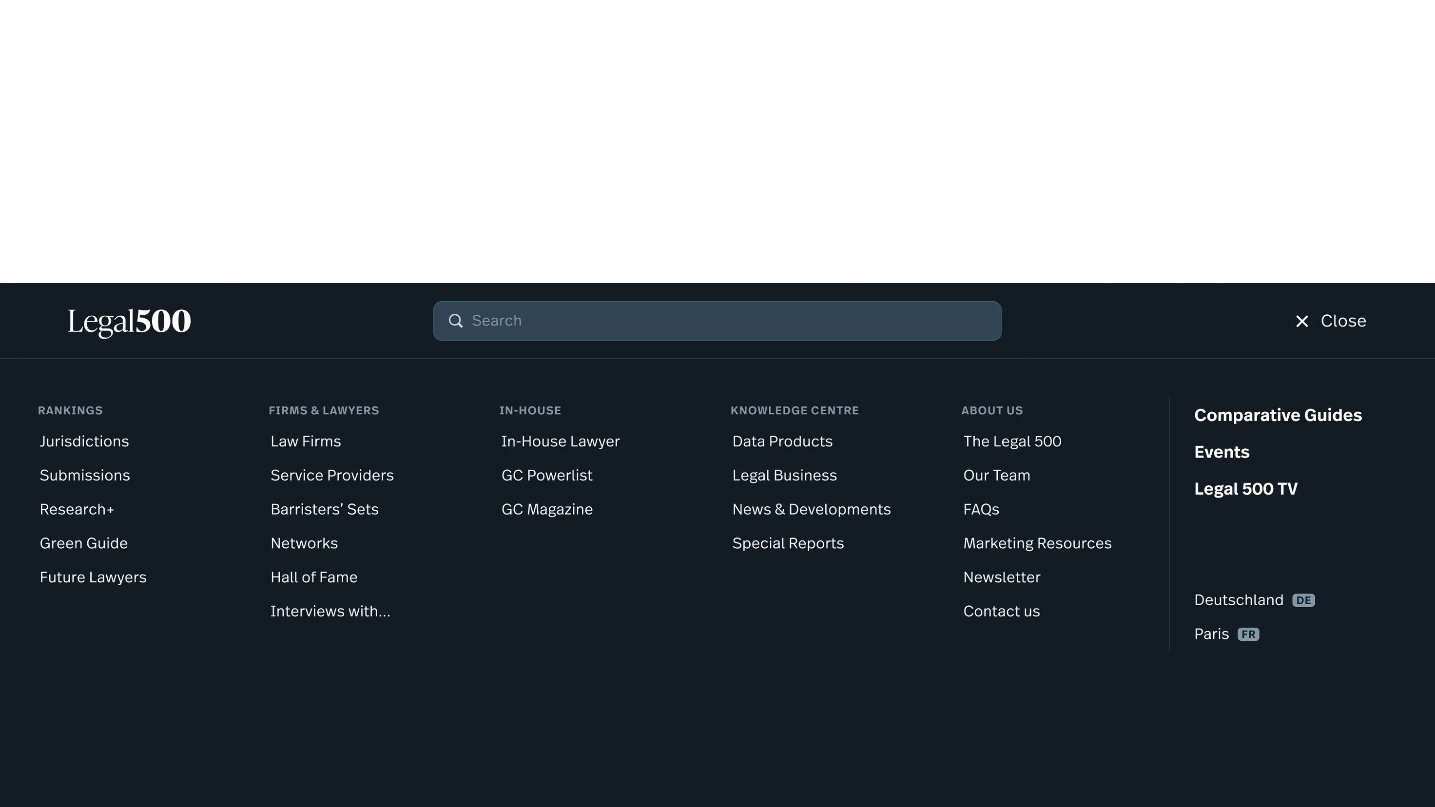
users. - Fragmented visual identity: With around 17 different masthead variations across its web properties, Legal 500’s brand lacked consistency and cohesion. The menu arrangement was really confusing – and the site’s hierarchy was not clear to the user.
- Mobile experience as an afterthought: The mobile experience fell far short of modern expectations, making on-the-go access a challenge for users. And despite Legal500.com relative success with SEO, the site was beginning to be penalised for having a poor experience for mobile use.
The Work
Spork stepped in with a fresh perspective, balancing creativity with strategic thinking to bring Legal 500’s website up to the gold standard their audience expected, and the company deserved. Here’s how we tackled the challenge:
